LEANNEST
Designing real care for real people.
A healthcare platform built for clarity, trust, and cultural respect — not just prescriptions.
PROJECT OVERVIEW
Simplifying complex health journeys with care and clarity.
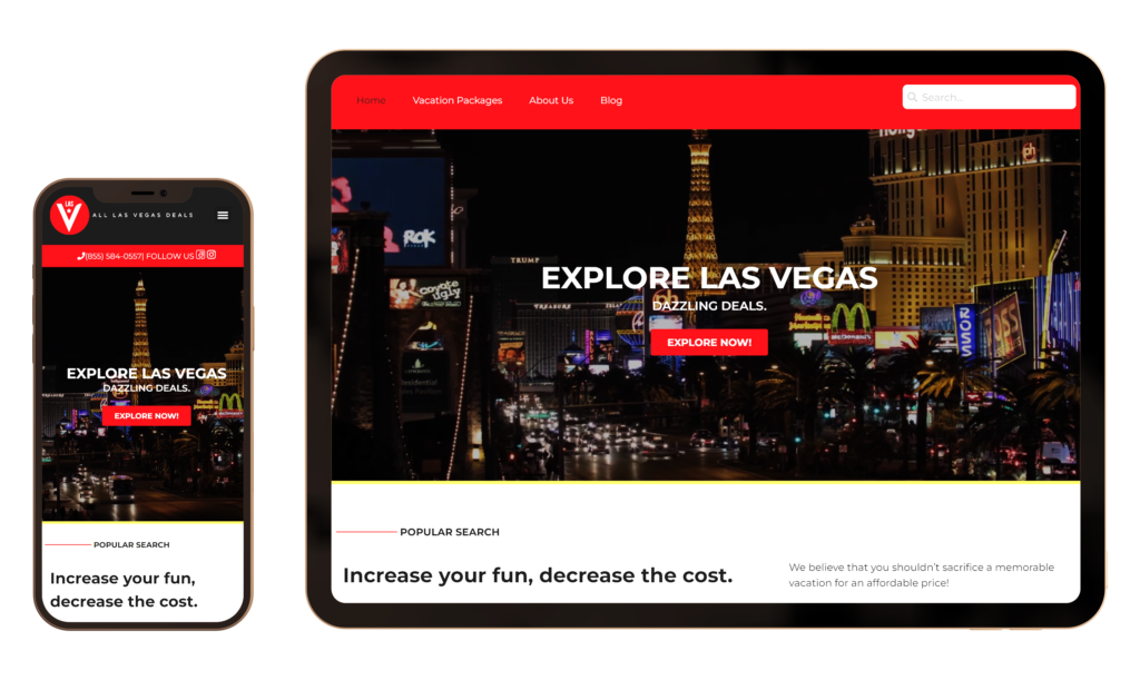
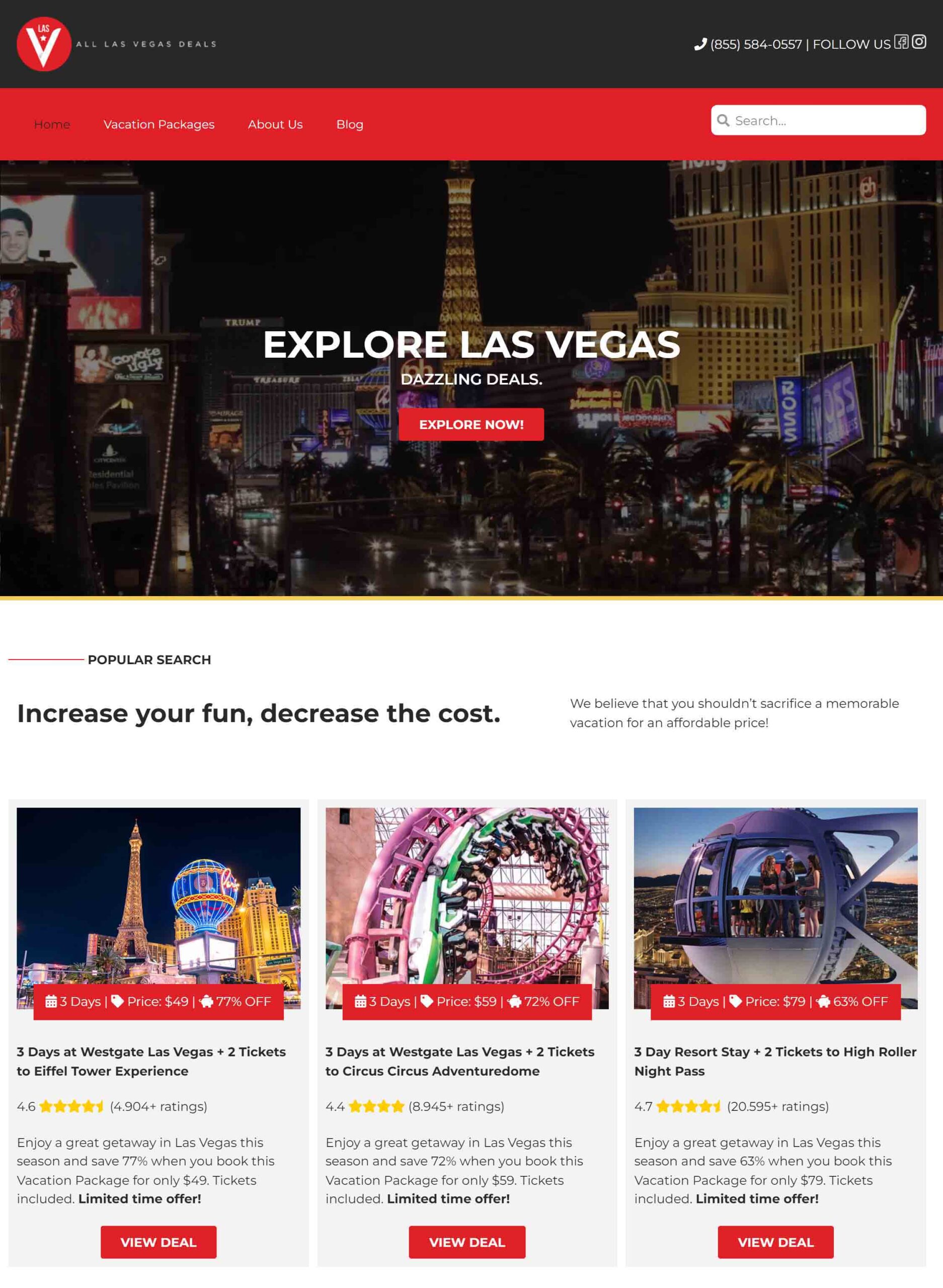
Leannest supports women starting GLP-1 treatment. I led the design of the full product experience — from multilingual onboarding to secure automations that followed health privacy laws — making each step clear, supportive, and trustworthy.
Client:
Leannest
Role:
Product Designer
Timeline:
12 weeks
The Challenge:
Leannest needed to turn a sensitive topic — GLP-1 treatment for weight loss — into a journey that felt simple, safe, and human.
The goal: increase conversion from curious visitors to confident patients, without losing trust along the way.
Step-by-step
The Process
We followed a lean, user-centered design approach — moving fast while staying grounded in empathy and clarity.
Step 1
EMPATHIZE
We looked at other apps and talked to real people to learn what felt confusing, cold, or unhelpful.
Step 2
DEFINE
People hated tricky subscriptions, missed real human help, and felt confused about the treatment.
Step 3
IDEATE
We designed flows that explained things clearly and added a real person right after the quiz — so users felt supported, not alone.
Step 4
PROTOTYPE
Designed and tested prototypes using real user content, including pre-qualification flows and WhatsApp triggers.
Step 5
VALIDATE
Gathered feedback through testing and live launches. Iterated on tone, structure, and support options based on user reactions.
Research & Insights
Real Problems
We studied top GLP-1 competitors and patient feedback to understand where trust was breaking down. Most platforms relied heavily on automation — but we learned that trust grew when patients could talk to a human right after being pre-qualified.
Confusion around GLP-1 medication and onboarding
Frustration with subscription models and unclear cancellation
Preference for talking to someone — not getting lost in a funnel
“I just needed a real person to explain things — not another auto-reply.”
Define: Key Product Objectives
Key Steps
Based on user interviews and technical constraints, we mapped out product objectives that would balance user trust with operational efficiency.
Pre-Qualification Form
Visual Design
Design Choices
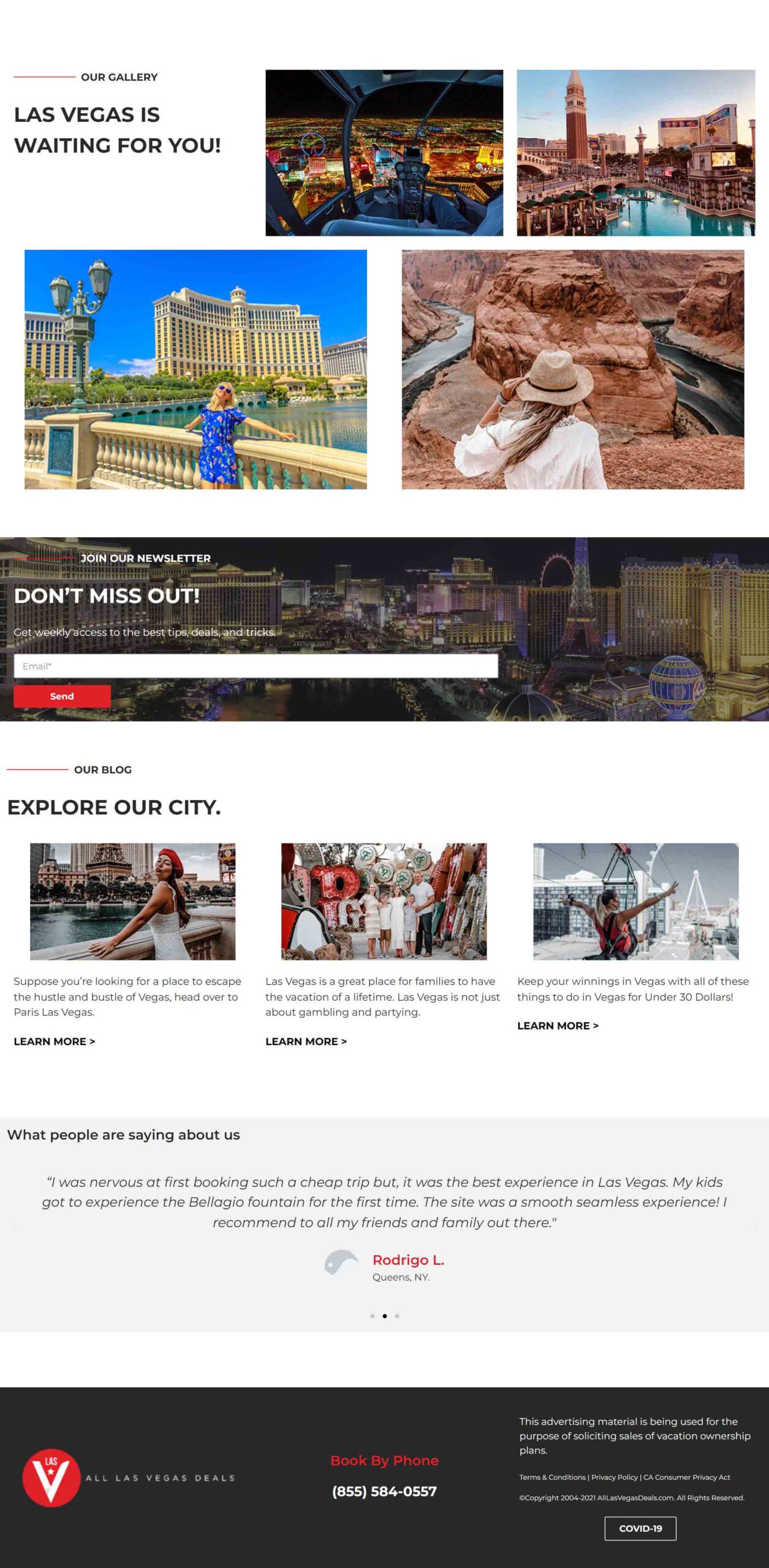
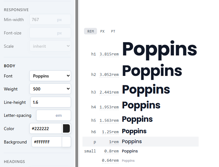
The visual direction balanced clinical precision with soft editorial cues. We used clean type, soft contrast, and clear spacing to help users feel calm and guided — not overwhelmed.
Design System
Automation & Tech
Smart Stack
We used n8n, JotForm (HIPAA compliant), and WhatsApp integrations to build a privacy-focused automation system — from onboarding to consult to ongoing care. Stripe handled the payment process cleanly, and data was routed securely to the provider via automations.
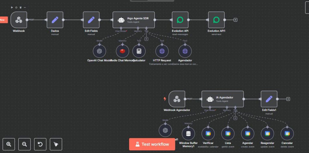
Part of n8n Workflow
Testing & Iteration
What Worked
During early testing, we noticed a significant uptick in conversion when users were offered direct human contact — especially via WhatsApp or SMS. This insight led us to prioritize real-time follow-ups from the provider, rather than automated reminders alone. It made the platform feel closer, safer, and more human.
Results & Reflection
Performance Highlights
In the first week, the platform received over 42 consult requests. The customer acquisition cost came in lower than leading competitors, and Facebook ad click costs remained under $7 — significantly below the industry average for telehealth.
This project taught me how trust is built one screen at a time. Good design isn’t just about what users see — it’s how they feel while moving through the experience.