Case Study / Web Design

Outmore Outdoor Design

A landscape design company with no website, no branding, and no online visibility — until we built it all from scratch.


Smart Reel Intelligence Dashboard

PROJECT OVERVIEW

Bringing outdoor excellence online — with strategy, design, and execution.

Outmore is a design & build company specializing in custom decks, pools, and outdoor living spaces. They had no website. No brand. No way to showcase their beautiful projects or capture new leads online. I partnered with them to design and launch a full online presence from scratch

Client:
Outmore Outdoor Design
Role:
Branding, UI/UX Design, Web Development
Timeline:
3 weeks (solo project, from discovery to launch)

The Challenge:

Outmore builds stunning outdoor environments — but they had no way to show them. No branding. No online presence. No lead generation system.

The goal: Build an online identity that feels as solid and thoughtful as the spaces they create.

Step-by-step

The Process

I followed a human-centered, design-thinking approach — blending research, branding, and execution to build a site that reflects the quality of Outmore’s work and turns visitors into clients.

Step 1

DISCOVER

I interviewed two key people from the team and also studied their main competitors. I wanted to understand not just what they do — but how they’re different.

Step 2

DEFINE

From all that, I narrowed the focus: the site needed to highlight their work, feel premium but grounded, and make it easy for people to get in touch.

Step 3

DEVELOP

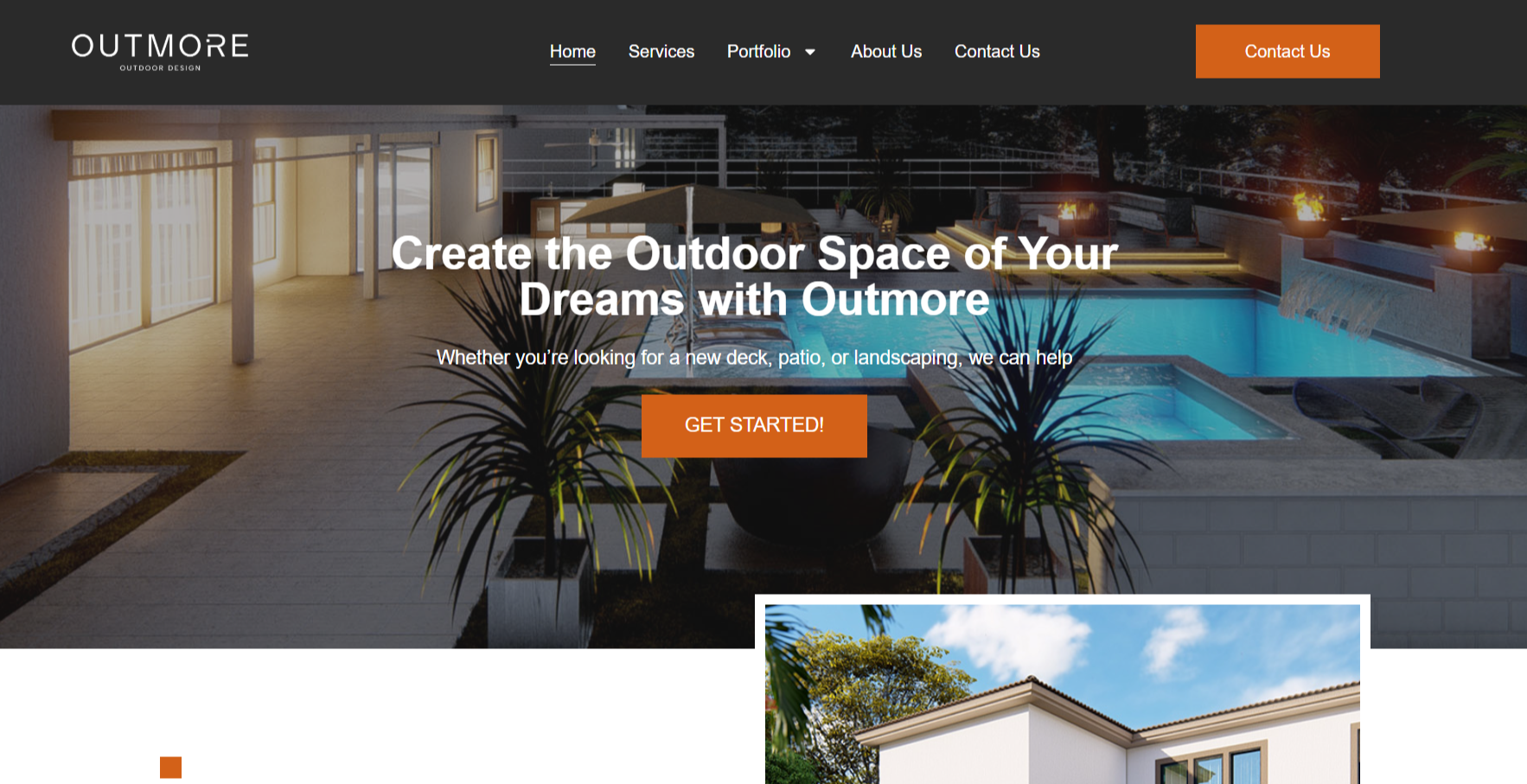
I designed and built everything using Elementor. Custom layout, easy to update, responsive, and zero guesswork on what goes where.

Step 4

DELIVER

Final round of tweaks with the team, handed everything over with clear instructions, and launched. Outmore went from having no presence at all — to having a site that sells their value.

STEP 1 - DISCOVER

When “Online Presence” Was Just a Logo

Outmore had no site. Just a logo — and the sense they didn’t exist.

I met with the founders. No brief. No assets. Just one goal:
“We need to exist online. And be reachable.”

Most competitors looked flashy or empty.
What was missing wasn’t style — it was clarity.

No presence. No point of contact. Just a logo.
No system to present work or convert interest.

Competitor sites lacked clarity or warmth.

“We didn’t feel real online. People couldn’t find us, and we didn’t know where to send them.”
Outmore Founders

STEP 2 - DEFINE

A Site That Shows, Not Just Says

The goal wasn’t to impress. It was to connect.

Outmore needed a clean, confident space to show their work and invite people in.
No fluff. No noise. Just trust.

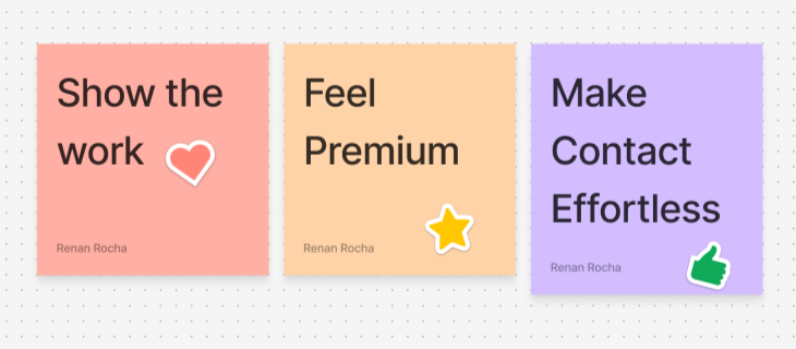
So I defined three pillars:

  • Show the work

  • Feel premium, but grounded

  • Make contact effortless

Everything from layout to tone would follow that.

STEP 3 - DESIGN

Quiet Design. Loud Work.

Every visual decision followed one principle: let the projects speak louder than the interface.

  • I used the brand’s original color palette to keep it recognizable and grounded

  • Built a clean layout with generous white space to avoid visual fatigue

  • Positioned CTAs where users naturally stop: hero, mid-scroll, and footer

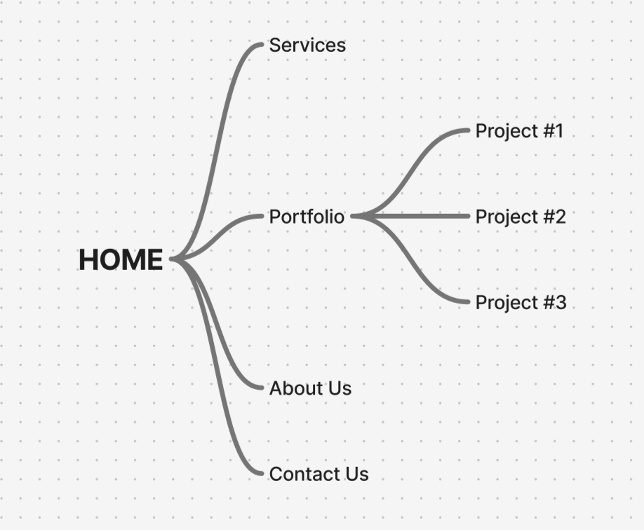
  • Designed a portfolio-first experience — minimal distractions, real results

This wasn’t about design for design’s sake.
It was about clarity, confidence, and conversion.

STEP 4 - DELIVER

From Invisible to Investable

Outmore went from having no digital presence to owning a clean, modern site that showcases their work and builds trust fast.

Clients now land on a space that feels curated, confident, and contact-ready — all without the clutter.

No site → Full site · Unseen → Visible · Disconnected → Reachable

Insights & Reflection

Simple wins. Clean structure, clear CTA, and bold visuals did more than trends ever could.


No presence is still a signal. When people can’t find you online, they assume you don’t exist. That was the real problem to solve.

Screenshot Capture - 2025-06-06 - 17-13-12

Smart Reel Intelligence

Next case

PIKICITY

Role:
UI/UX Design

Duration:
4 Weeks

About: A directory that lists all Brazilian’s business in the US. Helping business owners who are looking for a greater amount of exposure and consumers who are looking for places that speak their native language.

PIKI

CITY

42% of Brazilian residents in U.S have limited English proficiency, speaking English less than "very well".

Approximately 451,000 brazilian immigrants resided in the United States in 2017, an increase of almost a third over a seven-year period marked by difficult conditions in Brazil, including a recession accompanied by high unemployment and inflation.

Challenge
&Solution

Challenge

Many Brazilians are limited to looking only for businesses that speak their native language because they are unaware of terms related to a product or service in English, and many of them also want services or products similar to Brazil.

We performed 48 Interviews, among them, business owners and users.

When they search for referral in the Brazilian groups on Facebook and WhatsApp (mainly), it doesn’t work well. In WhatsApp groups, for example, there is a limited number of participants, disorganized and excessive advertisements and random subject, doesn’t offer rating or review where other users could classify in the most diverse categories about the service or product offered.

Solution

Create a website that owners can list their services by categories (organized list with search filters), easy to navigate and register, showing Brazilian business that are nearby listed with rating/reviews from other users to build more relevance.


Ideation

Initial sketches to help explore quick concepts and record ideas quickly

Main points:

1. Having a large and centralized search bar makes the search quick and easy.

2
. Most searched categories by users

3.
A section with six cards to arouse the user’s curiosity in exploring the website.

High-Filidelity

From the approved sitemap and wireframes, we moved into more solid high-fidelity wireframe.

Role:
UI Design

Duration:
2 Weeks

About:

All Las Vegas Deals is a website that features discount theme park tickets, hotel reservations and an array of individually tailored vacation packages to suit the needs of you and your family. From moderate and budget hotels to luxury and boutique resorts, you’ll find the lowest online rates for that perfect family vacation getaway.

EXPLO
RE LAS VEGAS
MAIN TASK

Create a Home Page showing the amazing savings that the website offers, a blog section, a newsletter to collect leads and the about section to establish credibility.

About Montserrat

The old posters and signs in the traditional Montserrat neighborhood of Buenos Aires inspired Julieta Ulanovsky to design this typeface and rescue the beauty of urban typography that emerged in the first half of the twentieth century

A a

MONTSERRAT

TYPO GRAPHY

Colors:

Add Your Heading Text Here

Lorem ipsum, or lipsum as it is sometimes known, is dummy text used in laying out print, graphic or web designs. The passage is attributed to an unknown typesetter in the 15th century who is thought to have scrambled parts of Cicero’s De Finibus Bonorum et Malorum for use in a type specimen book. It usually begins with:

“Lorem ipsum dolor sit amet, consectetur adipiscing elit, sed do eiusmod tempor incididunt ut labore et dolore magna aliqua.”
The purpose of lorem ipsum is to create a natural looking block of text (sentence, paragraph, page, etc.) that doesn’t distract from the layout. A practice not without controversy, laying out pages with meaningless filler text can be very useful when the focus is meant to be on design, not content.